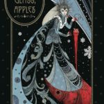
Dark Horse Books has been releasing a steady stream of stand-alone short stories by Neil Gaiman, each of them illustrated by a prominent artist. The latest one (due out on August 20th) manages to once again do the impossible: it takes a story that I already thought was perfect and makes it even better.
Click the jump for a review and preview pages of “Snow, Glass, Apples”, a collaboration between Gaiman and artist Colleen Doran.
One of my favorite genres is the re-told fairy tale, and this is a particularly dark, wonderfully sinister retelling of a famous fairy tale from the point of view of the “wicked” stepmother. I first read it in Gaiman’s short-story collection Smoke and Mirrors, and in his author’s notes he described this one as being like a virus, one that will completely change how you read the original tale.
(Side note: I’ve said this in other reviews, but if you haven’t had a chance to read one of Neil Gaiman’s collections then you really need to get ahold of one – any of them, they’re all excellent – because Gaiman writes some of the best author’s notes in the business. They’re full of interesting tidbits about how he got the idea for a story, or what was going on when he was writing it, and sometimes he’ll sneak a short story inside the notes about his short stories.)
Where was I? Oh yes, the fairy tale. With anyone else the central idea for the villain might come across as a little too horror-movie/fantasy, but Gaiman has chosen the perfect voice for the stepmother. She narrates in a simple storytelling tone that makes all of this so believable, very matter-of-fact and calm. But not unemotional. That’s important; all the emotion is conveyed just behind the words themselves.
The stepmother was obviously in love with the King, and terrified by the monster that’s threatening the kingdom. When she becomes queen she describes certain steps she has to take, but before that she describes in clinical and graphic terms the steps she should have taken. And then in one paragraph – one sentence – she tells us why.
I’m still amazed at how Gaiman can pack so much fear, regret, and just appalled grief into less than a dozen words.
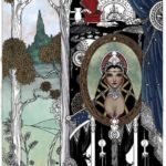
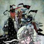
So the Not For Children story can already stand on its own. But the art, ah, the art. It’s just stunning. Decadent. Sumptuous. It’s like a combination of Alfonse Mucha, illuminated manuscripts, and illustrations from a book of Russian fairy tales. Every single element is meticulously designed: the faces, the clothes, even the strings of dried apples hanging from the ceiling. The motifs twist across the page, sunbursts and snowflakes, flowers and ribbons and flowing locks of hair, tree roots that reach out like tentacles. There’s zero filler artwork anywhere; the smallest details have intricate patterns inside them.
The graphic novel has an afterword by the artist where she provides a few in-progress sketches and gives some info on how she made the artwork. Doran apparently used a completely different process for this; the style is inspired by the artist Harry Clarke (do an image search for that sometime), and apparently it was some of the most labor-intensive work she’s done. In my opinion it’s worth every second, since it does something that I love: it’s a style that I never imagined for this story, and yet somehow it’s exactly what I wanted.


